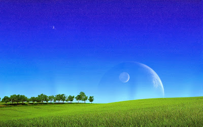
The masthead of the magazine is the publications title "Andromeda", named after the galaxy. The choice of the title "Andromeda" was influenced by the magazines music genre; electronic. The colour of the masthead is white, as it contrasts and yet compliments the dark blue sky background. Beneath the masthead is the magazines slogan "The Universe of Sound". "The Universe of Sound" slogan was chosen because it parallels science fiction as I wanted to do with this magazine, and because it portrays electronic music as something adventurous and worth exploring, sharing connotations with pioneering. I personally see electronic music as pioneering at the frontier of the 21st century, so the sub-title is very apt for both literary and artistic purposes.
Above the masthead is a bar containing information on the Issue Number, the month of release, and the price of the magazine, which is £3.49. Usually these bars go all the way across the top of the magazine, but in keeping with the science fiction theme mine is styled at a slant, and covering only 5/6 of the width.
The main image is the magazine is somewhat controversial. It doesn't follow the normal conventions of a magazine front cover, in which a model being the focus would face the camera, but rather the outlandish scenery and visuals are the focus of the image. This was intentional; This issue is the magazines first, so I wanted to make a dinstrict limited edition front cover to establish the magazine. As I stated before, the magazine is artistically inspired by science fiction and the idea of exploring "The Universe of Sound". The image is successful in portraying the electronic music universe as beautiful and wothy of exploration, which the model character of the image, (me), achieves by gazing into the distance in wonder and awe.
The original image for the front cover was me stood in a field looking up at the sky. Similar to the image except it was raining originally and there were no planets in the sky.
(Unfortunately I removed the sky in Photoshop before I could save the image. Oops.)
I successfully cropped myself from this image and placed myself in a landscape image I found trawling through Google Images.
I placed myself over the image and erased my legs in the pattern of grass, creating the illusion of me standing in the grass. This created the front cover image.
Stories are arranged on the left, Featured Artists on the right, arranged around the the planet, accenting the image without completely defying convention. The implementation of Stories and Featured Artists helps remove excess space in the image, whilst fulfilling magazine criteria in informing potential readers on the magazine content.
The final addition to the front cover was the barcode and Facebook/Twitter tags in the bottom-right. Not the most aesthetically pleasing, but necessary for a commercial publication.


No comments:
Post a Comment