Tuesday, 17 December 2013

Double Page Spread Evaluation


The masthead of the double-page spread "Coyote Kisses: Step Into The Light" spans both pages. "Coyote Kisses" references the feature topic, the band, whilst "Step Into The Light" refers to the article content, which conveys the bands music as the future of electronic, and the featured image of a character stepping into the light, whilst maintaining the cinematic theme of the magazine established on the front cover.

The concept for the double-page spread was simple. I wanted a lot of white space available for text, yet an artistic enough image to match the style of the front cover. I decided that the text should cover the sky portion of the image, whilst the lower half of the double-page spread be a nice artistic photo. The model in the photograph is intentionally off-centre so as the image was not ruined or distorted by the divide between the pages. Instead, the model is on the right, not the left, so as not to distract readers who would of course read from left-to-right.

The article text follows the regular conventions of magazine publications; it is written in columns, paragraphed frequently, and implements humour and both colloquial and professional lexis to keep the material fresh for the readers.

Beside the main image is an annotation box; "Coyote Kisses Top 5 Tracks", listing the editor's (my) favourite songs by the band for the benefit of the readers.

The image has been edited mildly. Originally, the model was walking up a rainy hill. The lighting was altered and a sunbeam effect added in Photoshop to create this image:


The hue/saturation was then altered to slightly create a more outlandish and fantastical image:


With the addition of a masthead and the magazine text (and a few edits) the double-page spread was finished:

Monday, 16 December 2013

Front Cover Evaluation


The masthead of the magazine is the publications title "Andromeda", named after the galaxy. The choice of the title "Andromeda" was influenced by the magazines music genre; electronic. The colour of the masthead is white, as it contrasts and yet compliments the dark blue sky background. Beneath the masthead is the magazines slogan "The Universe of Sound". "The Universe of Sound" slogan was chosen because it parallels science fiction as I wanted to do with this magazine, and because it portrays electronic music as something adventurous and worth exploring, sharing connotations with pioneering. I personally see electronic music as pioneering at the frontier of the 21st century, so the sub-title is very apt for both literary and artistic purposes.

Above the masthead is a bar containing information on the Issue Number, the month of release, and the price of the magazine, which is £3.49. Usually these bars go all the way across the top of the magazine, but in keeping with the science fiction theme mine is styled at a slant, and covering only 5/6 of the width.

The main image is the magazine is somewhat controversial. It doesn't follow the normal conventions of a magazine front cover, in which a model being the focus would face the camera, but rather the outlandish scenery and visuals are the focus of the image. This was intentional; This issue is the magazines first, so I wanted to make a dinstrict limited edition front cover to establish the magazine. As I stated before, the magazine is artistically inspired by science fiction and the idea of exploring "The Universe of Sound". The image is successful in portraying the electronic music universe as beautiful and wothy of exploration, which the model character of the image, (me), achieves by gazing into the distance in wonder and awe.

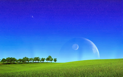
The original image for the front cover was me stood in a field looking up at the sky. Similar to the image except it was raining originally and there were no planets in the sky. 

(Unfortunately I removed the sky in Photoshop before I could save the image. Oops.)

I successfully cropped myself from this image and placed myself in a landscape image I found trawling through Google Images.


I placed myself over the image and erased my legs in the pattern of grass, creating the illusion of me standing in the grass. This created the front cover image.


Stories are arranged on the left, Featured Artists on the right, arranged around the the planet, accenting the image without completely defying convention. The implementation of Stories and Featured Artists helps remove excess space in the image, whilst fulfilling magazine criteria in informing potential readers on the magazine content.

The final addition to the front cover was the barcode and Facebook/Twitter tags in the bottom-right. Not the most aesthetically pleasing, but necessary for a commercial publication.

Thursday, 14 November 2013

Music Magazine Texts

Before I began producing my music magazine I drafted the bulk of its concepted text in a word document so as to keep track of the text content I was writing, and to plan ahead as writers should do to avoid continuity errors or writers block.

I am now satisfied with the content I have planned for my magazine and will now produce it using this document as a guide.


Wednesday, 13 November 2013

Title Font Selection

The title of my magazine is intended to be highly stylized, inspired by science fiction; hence it is named after the galaxy Andromeda. Such a title respectively requires a matching font. Below are some I have selected from the website Dafont under their "Sci-Fi" section which I think would suit my magazine and its science fiction theme.


I am impartial to the fonts I have selected as I like them all, so I shall draft the magazine with each of them to see which is the best fitting. However, I will most likely choose a solid looking font solely for the psychological effect of confidence on the viewer.

Wednesday, 6 November 2013

Music Magazine Plan - Front Cover, Contents and Double-Page Spread

The front cover of my magazine is simplistic in design but I hope for it to look elegant and intricate once I have finsihed it. After a lot of consideration, I plan to name my magazine Andromeda (or Andromedia) after the galaxy, as electronic and dubstep music is often associated with science-fiction and space. Also I believe Andromeda (Andromedia) sounds kinda cool.

The background will comprise of a photoshopped image of someone looking up at the sky, and in the sky is a large and dazzling view of space; planets, stars, lights, the usual. However I dont want the image to be overwhelming so it will be mellowed down and placed for the most part in the background. The primary and secondary stories will focus on artists and albums I have yet to decide, but I have concluded not to implement additional images.

"Andromeda" will the masthead, written in a sci-fi-esque font reminiscent of Star Wars or Star Trek.


The contents page is designed simple, and I plan for it to stay simple. The masthead will say "Contents" in the same font as "Andromeda" on the front cover. Beneath it will be the latticed story-feature squares, however I doubt there will be 12 as pictured below. I think I might settle for 6, at most 9. The only image on the page will be another image of a somewhat normal scene with additional space-stuff.


The double page-spread will feature a landscape image in the background, with the focus of the image where the text is not. The masthead is not in the centre but on the left so as the title is not split by the fold. There will likely be 2 or 3 columns of text on each side, bordeing the main image, complimented by secondary images and annotation boxes.


The second page will essentially be a reflection of the first page but feature more little secondary text boxes and images to balance out the lack of a masthead. At the bottom of the second page will be a masthead sized text box I will use to summarize the article.


Tuesday, 5 November 2013

Photoshoot Plan

My music magazine is themed on the electronic music genre which makes it a little difficult for me to think of ways in which it can be represented in photographs. I decided that it would be best to take some photos, out in the woods somewhere, and then edit the images in photoshop so as I could include lights and effects to make it look electronic-esque.

I considered the possibility of using a studio for my photoshoot but I feel as though the outdoors represents what I want to express with my magazine, (Freedom, etc.), rather than an enclosed space. Yet a simple picture of woodlands or a person has no relation to electronic. I concluded a blend of both natural and unnatural elements were required for the images I wanted my magazine to feature. In reaching this decision I realised I had made a bold artistic decision, not just for my images but for my magazine as a whole, that my magazine would feature surreal images in order to express the music visually.

So I plan to take my camera down to the woodlands and shoot several photos in various poses and locations, keeping in mind what will need to be edited in post-production, for example ribbons of light, colours, planets in the sky or a whole magnitude of other electronic elements.

Friday, 25 October 2013

Audience Data Summary

With the data I gathered from my SurveyMonkey music magazine survey I have assertained a lot of useful information to aid in the development of my magazine.

Foremost, my survey yielded a gender ratio of 78% male to 22% female; admittedly more girls than I expected but I have no objections. The addition of girls in the target demographic only increases my potential magazine content.

My main age demographic is from 14 to 29 years of age. A near-exclusively young target audience gives me free reign to create content I would like to see myself, as a member of the age 14-29 electronic fanbase.


Tuesday, 22 October 2013

Audience Survey

I have decided on my music magazine's genre being Electronic so I devised a small survey to aid me in understanding my audience on a more personal basis.


The answers won't have any drastic effects on the magazine, but, for example, if a majority of the audience are female then the final product will be aimed towards girls; or women, depending on the aggrigate age.

The third question is to find out the specific sub-genre of electronic, or any hybrid genres, the potential readers will be interested in so as I can include them in the content of the magazine.

The fourth question, "who is your favourite artist?", is included to scout what artists I should implement in the magazine's main features that the potential readers would be willing to purchase.

Thursday, 17 October 2013

Electronic Music Audience Mood Board

I have chosen to focus on electronic music for my music magazine project. To understand my music demographic better I did some research on the internet and created a mood board to help develop my magazine for my audience.


A recurring feature of the images I found was the colour scheme; dark backgrounds with bright or luminous features such as objects or people. Another inherant feature of electronic music is ultramodern style and fashion such as the glasses, the cryptic glyphs that represent the bands, and the science-fiction-esque technology in the top-left corner.

Many of the photos I collected portray the audience of electronic music raving and partying as they like to do. Electronic music fans enjoy partying and raving and moshing at live concerts as much as, if not more than any other genre fans.

The electronic music culture is a dedicated and devoted community, so a electronic music specific magazine seems contextually and economically viable.

Monday, 14 October 2013

Music Magazine Focus Group

Music Magazine Focus Group

I created and interviewed a focus group of Year 13 students to attain information on their taste in music, and to help develop my own magazine.

In response to the question “Should a magazine be targeted to a certain genre?” the consensus was yes.  If could focus on a small group of genres, but if it engaged too many it would have to either “too vague or as big as a book”. This response helped me decide that my music magazine will focus primarily on electronic, dubstep, rock, and country music; omitting metal, pop, classical, punk, and other such genres. Admittedly an odd combination that I plan to package as “new wave” or “chill” or something along the lines of a style rather than genre.

When asked; “ What is your favourite genre of music?” there were a wide variety of answers, from reggae to indie. Very little mention of the genres I myself prefer and plan to write about, but it was clear from their responses that they wanted at least a small variety, not a genre-specific magazine. This helped me to decide not to limit my genres but combine them in a new style, which is still a work in progress. Also, realising that many genres that will not feature were brought up in the discussion gave me the idea of a remix feature of the magazine; The remix feature will have remixes of songs from other genres so as not to isolate the magazine from other sects of the music industry.

Finally, when asked “Who is your favourite music artist?” the most talented and popular of their respective genres were all mentioned; Bob Marley for Reggae, Arctic Monkeys for Rock, The 1975 for Indie, Skrillex for dubstep, etc. These answers helped me realise that my magazine should feature the famous of my chosen genres as well as the talented, the up-and-coming and so forth in order to appeal to the right people and introduce them to similar music.

Tuesday, 8 October 2013

Audiences

Definition: An individual or group of people who read or consume any media text.


Why are audiences important?

Without audiences there would be no media.

Media organizations produce media texts to make profit – no audience = no profit.

The mass media is becoming more competitive than ever to attract more and more audiences in different ways and stay profitable.


Impact of new technology on audiences

Old media (TV, print, radio) which used to have high audience numbers must now work harder to maintain audience numbers.

Digital technology has also led to an increasing uncertainty over how we define an audience, with the general agreement that a large group of people reading the same thing at the same time is outdated and that audiences are now “fragmented”.


Fragmented Audience

The division of audiences into smaller groups due to the variety of media outlets.

The aim is to hit as many people as possible/sell more copies/generate a larger audience. But measuring that audience becomes difficult. You may have some people that only look online, some that only read the hard copy, or some that do both.


Types of audience

Mass audience – Media and communication that targets a very large group of people.

Niche audience – A small, select group of people with a very unique interest.
Psychographics

Every advertiser wants to target a particular type of audience. Therefore, media companies produce texts that target a particular “type” of audience.

In terms of commercial media, much of their funding is generated by advertising revenue. Their product needs to appeal to a specific type of audience so that advertisers will pay.


Group A – Doctors, Lawyer, Scientists, well paid professionals
Group B – Teachers, Middle management, fairly well paid professionals
Group C1 – Jr management, bank clerks, nurses, “white collar” professionals
Group C2 – Electricians, Plumbers, Carpenters, “Blue Collar” professionals
Group D – Manual workers, Drivers, Post sorters
Group E – Students, Unemployed, Pensioners


How do we measure audience sizes?

Sales, subscriptions, ratings, figures

Research a similar magazine and found out it’s audience size, subscription too, etc.


Age, Gender, Education, Profession, Interests and Hobbies, Fashion, Music Taste, Style, Social Media – Create a mood board of target audience.

Friday, 20 September 2013

School Prospectus Cover

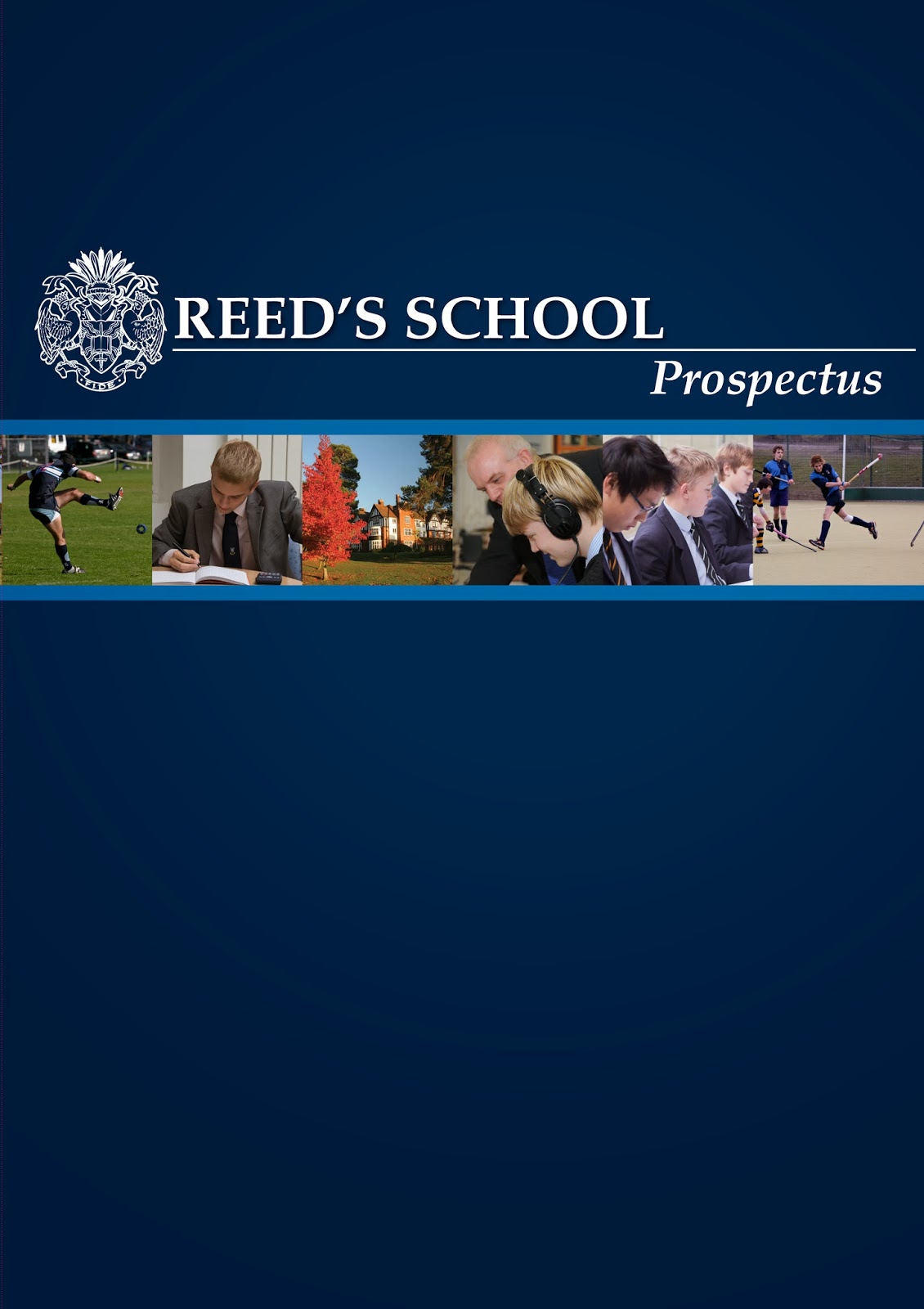
This is my school magazine cover:


Obviously it's not the greatest magazine cover I've ever seen or ever will, but it's alright I think. For my first anyway.

The masthead is a boring "Misbourne" because I felt alliteration was too childish, that picking a random noun was stupid, and all the other nice school related titles had already been taken. Besides, "Misbourne isn't so bad; it's short and to the point - that this is a magazine about the Misbourne school. It is in a hand-writing themed font to demonstrate that the publication is not formal but the written word of student gossip, funny stories, jokes or whatever; purely for entertainment purposes.

The main image on the front cover is a very blatant joke, accompanied by its sub-title; "Misbourne Students: Highly Employable". Adam in his McDonalds hat juxtaposes the statement "highly employable" to mean employable by McDonalds. Its a combination of three images edited together. The first is me stood on a stage, posing as Mr Preston saying nice encouraging words to the students, which I then edited the face of Mr Preston onto in Photoshop, and the final being Adam in his fast-food attire projected onto the backdrop, also done in photoshop.

Lower down the page, there are three more main stories, each in their respective boxes, and each hyperbolised for comical purposes more than anything, and then a final three sub-stories on the lowest bar of the page.

The colour scheme of the magazine focuses on the school's official colours, of either past publications or uniform. The background is therefore a gradiented pallet of white-grey-blue-dark blue (That I made in Photoshop), the blue shades representing the new uniform of the school, and the white to accomadate for the masthead which had an awkward white background. The red fonts represnt the ties of yore,before our recent fashion revolution within the school, bringing a nostalgic vibe to the older Misbourne student readers. But in all seriousness red is a colour that stands out.

I wanted to make anything unlike a regular prospectus. Which are just boring if I'm honest.

Sunday, 15 September 2013

School Prospectus Photos

So we start making our prospectus front covers at school on Monday and in preparation we took our own photos to be used. My prospectus is intended to be a parody of informational papers but keeping a serious tone, similarly to The Onion, so the pictures are normal(ish) and will instead have hopefully funny titles.


For example this photo is self-evidently very not funny. But add a sub-title something along the lines of "Gordon Ramsay: School Cafeteria Nightmare", etc. it's at least interesting in its own way.

Combine it with a photo such as...


And hey-presto you've got yourself a funny McDonalds related story. Or perhaps use it individually on a different story under the sub-title "Misbourne Students Highly Employable" to put a whimsical spin on a phrase the faculty staff love bragging about so often.

Tuesday, 10 September 2013

School Magazine Contents Page


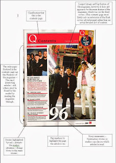
This is a mock contents page for my school magazine.It follows a basic formula in its graphological features; The box grid is two small stories, a central main story, and then two more peripheral stories. Each accompanied with page numbers, to inform readers to which page the stories are on.It is very basic, but performs its function efficiently as a mock-up.